HCL TECHNOLOGIES
Business Experience Designer (XD India)
FMCO Case Study
First MCO Auto Management Enterprise System

The First MCO (FMCO), the business workflow, was established and implemented in phases. This involves utilising the current system and the new functionality listed below to fulfil the proposed workflow. PIP Case Management of New Jersey s Auto claims includes Decision Point Review, Pre-Certification, and Utilisation Review. These processes are initiated by three state forms Attending Physician Treatment Plan, Pre-Service Appeal, and Post-Service Appeal. First MCO's business processes for Decision Point Review, which includes Medical Director Review, Independent Medical Examination, and Pre-Certification, along with implementing the First MCO Auto Management Enterprise System (FAMES) project Phase 1, was to ensure efficiency and accuracy.
How User Research, Design Thinking & Iteration Solved a Complex Auto-Claims Workflow
1. The Situation:
When Paper Slowed Down Critical Decisions. At First MCO (FMCO), Decision Point Review was the heart of New Jersey’s Auto PIP claims process.
Every claim passed through:
-
Medical Director Review
-
Independent Medical Examination (IME)
-
Pre-Certification
-
Utilization Review
But the system behind it was fragile.
Most work still depended on:
-
Paper forms
-
Manual tracking
-
Faxed or scanned documents
-
Multiple handoffs between teams
Every delay meant:
-
Slower claim decisions
-
Higher operational cost
-
Risk of non-compliance
-
Frustrated doctors and nurses
The business asked one simple but dangerous question:
“Can we move to digital without breaking what already works?
”Thus began Phase 1 of FAMES — the First MCO Auto Management Enterprise System.
2. The Design Challenge
The problem wasn’t just “make a new system.
”The real constraints were:
-
Existing paper forms had to stay visually familiar
-
Labels and fields could not change drastically
-
Users were not tech-savvy
-
Volume was high, timelines were strict
-
Errors had legal consequences
So the design goal became:
-
Digitise without disrupting.
-
Improve without overwhelming.
-
Automate without losing trust.

3. Starting with People, Not Screens
Begin with User Research-
We began by meeting the real heroes of the system:
-
Medical Directors
-
Review Nurses
-
Case Managers
-
Admin Staff
We observed them:
-
Filling paper forms
-
Searching for missing pages
-
Calling physicians for clarifications
-
Rewriting the same data again and again
We conducted:
-
Contextual interviews
-
Shadowing sessions
-
Process mapping workshops
What We Discovered
-
Speed mattered more than beauty
-
Errors usually happen during re-entry
-
Users relied on memory, not system help
-
People feared “new systems”
-
Familiar layout = confidence
One nurse said:
“If the screen looks like the paper I know, I’ll trust it. If it looks new, I’ll be scared to click.
”That single sentence shaped the entire design.
4. Defining the Real Problem
Using Design Thinking, we reframed the challenge:
Not:
“Build a digital claims system.”
But:
“How might we help medical and review teams make faster, safer decisions without changing the way they think?”
Personas

Dr. Michael Ramirez
Medical Director
Age: 37
Dr. Ramirez is an experienced medical director with expertise in reviewing and approving treatment plans for auto claims. He has a deep understanding of medical guidelines, regulations, and the decision-making process involved in the Decision Point Review. Dr. Ramirez plays a crucial role in ensuring the accuracy and compliance of the review processã
Goal
-
Review and assess treatment plans for medical necessity and adherence to guideline
-
Collaborate with other stakeholders, such as attending physicians and utilization review nurses, to gather additional information
-
Streamline and improve the efficiency of the Decision Point Review process
Challenges
Needs
-
Managing a high volume of review cases within a strict timeline
-
Staying up-to-date with evolving medical guidelines and regulation
-
Balancing the need for accurate decision-making with efficient workflow processes.
-
Needs fast access to case details
-
Reviews dozens of cases daily
-
Hates scrolling and hunting
-
Wants accuracy without delay

Rachel Anderson
Review Nurse
Age: 32
Rachel is a dedicated utilization review nurse responsible for reviewing and monitoring the utilization of medical services for auto claims. She has a strong knowledge of medical procedures, healthcare protocols, and insurance guidelines. Rachel s expertise ensures the appropriate and cost-effective use of medical resourcesã
Goal
-
Conduct thorough reviews of medical records to determine the medical necessity and appropriateness of services
-
Communicate and collaborate with attending physicians and other healthcare providers to gather relevant information
-
Support the implementation of the FAMES project and the transition from paper documents to electronic records.
Challenges
-
Handling a large volume of cases while maintaining attention to detail
-
Adapting to new technology and systems during the transition to electronic records
-
Ensuring effective communication with various stakeholders involved in the Decision Point Review process.
Needs
-
Handles high volume
-
Manages transitions from paper
-
Needs clarity, not complexity
-
Wants guidance from the system
Every screen asked one question:
“Would Dr Michael find this fast?”
“Would Rachel feel safe using this?”
6. From Chaos to Structure: Information Architecture & Mind Mapping

We mapped:
-
Every form
-
Every decision step
-
Every handoff
Then created:
-
Mind maps
-
Task flows
-
Decision trees
We grouped:
-
Claim info
-
Patient info
-
Provider info
-
Review actions
-
Compliance steps
Nothing was added unless it supported a real task.
7. Designing with Familiarity First
Key UX Principles
-
Same labels as paper forms
-
Same sequence as paper flow
-
Fewer fields, smarter grouping
-
Inline validation
-
Auto-completion
-
Input masks
-
Clear buttons for actions
-
Links for information
-
Hotkeys for frequent actions
-
“X” to close, always respected
We avoided:
-
Fancy placeholders
-
Hidden actions
-
Overloaded screens
The system spoke the users’ language — not the designers’.
8. Iteration: Design, Test, Fix, Repeat
Round 1:
Low-Fidelity Wireframes
We tested:
-
Navigation flow
-
Field placement
Screen orderFeedback:
-
“Too many fields on one screen”
-
“I can’t see what’s mandatory”
-
“I miss my old section order”
We changed.
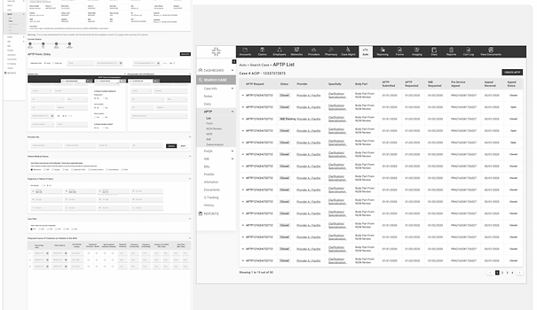
Round 2:
High-Fidelity Prototype
We added:
-
Visual hierarchy
-
Formatting for critical info
-
Error messages
Environment colour differences (Test vs Live).
Tested with:
-
Doctors
-
Nurses
Admin usersFeedback:
-
-
Faster than paper
-
Less re-entry
-
Fewer mistakes
-
Less calling back doctors
One nurse said:
“I don’t think anymore. I just follow the screen.”
That was a success.

Wireframe/Designs
https://xd.adobe.com/view/5fc3b160-4399-48a4-8264-cc1931341437-0a90/
ttps://xd.adobe.com/view/a4a58cf3-8048-4ee2-8a42-e44fe5c21386-f1f6/?fullscreen
https://xd.adobe.com/view/5fc3b160-4399-48a4-8264-cc1931341437-0a90/
9. From Paper to Digital — Without Breaking Trust
The biggest win:
-
Same labels
-
Same logic
-
Same flow
-
But now:
Automation quietly removed friction while keeping familiarity.
-
No lost papers
-
No double entry
-
No unclear handwriting
-
No manual tracking
10. Business Impact
FAMES Phase 1 delivered:
-
Faster Decision Point Reviews
-
Higher accuracy
-
Better compliance
-
Lower operational cost
-
Reduced manual work
-
Faster training for new staff
Business goal achieved:
Efficient, compliant, and scalable PIP Case Management.
11. Validation & Continuous Learning
After launch:
-
Prototype shared via email
-
Feedback collected on same prototype
-
Multiple user groups involved
-
Changes made based on real use
Design didn’t stop at launch.
It evolved with users.
12. Conclusion & Final Reflection
This was not just a “design project.”
It was a trust-building project.
We didn’t force users to change.
We changed the system to respect them.
By combining:
-
User Research
-
Design Thinking
-
Iteration
-
Validation
We turned a risky digital transformation into a safe, trusted, and successful system.
FAMES Phase 1 proved that good design doesn’t shout.
It quietly makes hard work feel easy.